If you've ever tried to force the WordPress Navigation block to show a hamburger menu at a custom breakpoint, you've probably discovered that it's surprisingly resistant to CSS manipulation. I lost a solid afternoon to this on a recent Twenty Twenty-Five build before landing on a solution that actually works.
The Navigation block in WordPress block themes has a mind of its own. It decides when to collapse into a hamburger based on internal logic and default breakpoints that don't always align with your design requirements. And when you try to override it with CSS, things break in unexpected ways.
Here is the fix that works, and more importantly, why it works.
The Problem
The WordPress Navigation block collapses to a hamburger menu around 782px by default. For plenty of designs, especially those with longer navigation items or multiple menu sections, that's far too narrow. The menu starts overlapping or wrapping before WordPress decides to show the hamburger.
The obvious solution is to write some CSS that hides the full menu and shows the hamburger button earlier. Sounds simple. It isn't.
The Navigation block doesn't use a simple .nav-menu class you can toggle. It uses a nested structure of containers, responsive wrappers, and state-based classes. Hide the wrong element and you'll either get a blank mobile menu, duplicate menus, or a hamburger that opens to nothing.
Why This Is Harder Than It Should Be
WordPress core contributor richtabor noted in a Gutenberg discussion:
"The menu collapses into a hamburger too soon? Or too late, if there are more items in it than horizontal space provided."
- richtabor, WordPress Core Maintainer, Gutenberg GitHub Discussion
This perfectly captures the frustration. The "right" breakpoint depends entirely on your specific navigation: the number of items, the length of each label, the available space in your header layout. WordPress can't predict this, so it picks an arbitrary value. And changing that value requires understanding how the block actually manages its responsive state.
Here's what most developers try first, and why it fails:
- Hiding
.wp-block-navigation__container: This hides the menu list but leaves the hamburger button visible with nothing to toggle - Using
display: noneon the parent: This hides everything, including the mobile menu when it opens - Creating duplicate Navigation blocks: One for mobile, one for desktop. Works, but now you're maintaining two menus
If you're using a page builder rather than the native block editor, Elementor V4's CSS-first approach handles responsive navigation natively. But for block themes, the CSS fix below remains the most reliable solution.
The Fix
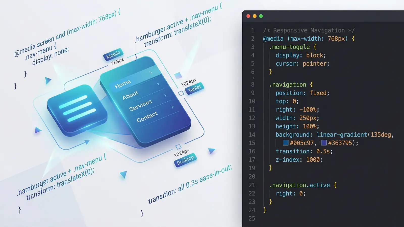
Here's the CSS that actually works:
@media screen and (max-width: 1280px) {
  /* Show the hamburger button */
  .wp-block-navigation__responsive-container-open {
    display: block !important;
  }

  /* Hide the full menu, but only when the modal is closed */
  .wp-block-navigation__responsive-container:not(.is-menu-open.has-modal-open) {
    display: none !important;
  }
}
Change 1280px to whatever breakpoint suits your design. The rest stays exactly as written.
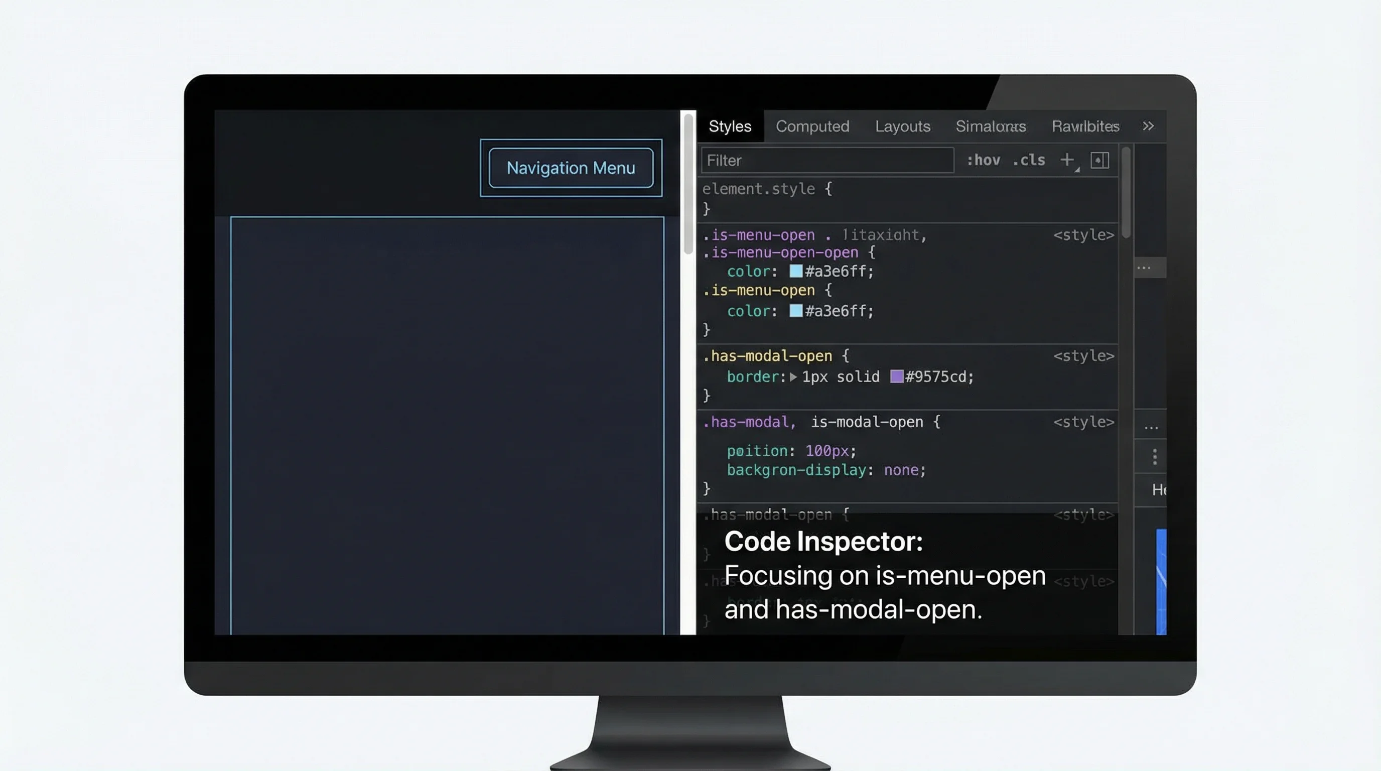
Why This Works
The crucial line is the :not(.is-menu-open.has-modal-open) selector. When someone clicks the hamburger button, WordPress adds two classes to the responsive container: is-menu-open and has-modal-open. These classes tell WordPress (and now your CSS) that the mobile menu modal is currently visible.
By wrapping our display: none in a :not() condition, we're saying: "Hide this container, unless the modal is open." When the modal opens, both state classes are present, the :not() condition becomes false, and the container becomes visible again showing the full mobile menu.
Without this conditional, you'd hide the container permanently, including when the user tries to open the mobile menu.
As Harry Roberts notes in CSS Guidelines:
"There is no tool, no preprocessor, no magic bullet, that will make your CSS better on its own: a developer's best tool when working with such a loose syntax is self-discipline, conscientiousness, and diligence."
- Harry Roberts, CSS Guidelines
This fix is a good example of that principle. There's no magic property or special WordPress hook that makes custom breakpoints "just work." The solution requires understanding how the block manages its state and writing CSS that works with that system rather than against it.
Changing the Breakpoint
The 1280px value is not fixed. I used it for a site with a long navigation and a centred logo that ate into the available horizontal space. Adjust based on your layout:
- 1024px: Typical tablet landscape, useful for medium-length menus
- 1280px: Catches most smaller laptops, good for longer menus
- 1440px: Aggressive, but necessary for very wide headers or multi-level navigation
- 768px: Below WordPress's default, rarely needed unless you want to delay the hamburger
Test at your chosen breakpoint by resizing the browser. The hamburger should appear when you cross the threshold, and clicking it should open a functional mobile menu with all your navigation items.
Common Mistakes to Avoid
A few things that will break this approach:
Forgetting the :not() condition
If you write .wp-block-navigation__responsive-container { display: none; } without the state class check, the mobile menu will never appear. The container needs to be visible when the modal is open.
Targeting the wrong container
The Navigation block has several nested elements. .wp-block-navigation__responsive-container is the one that WordPress uses for responsive behaviour. Hiding .wp-block-navigation__container instead will break the mobile menu.
Over-specifying the selector
Adding extra parent selectors can cause specificity issues where your CSS loads before WordPress's styles and gets overridden. The !important declarations handle this, but keep the selectors simple.
Not testing the mobile menu
The hamburger appearing is only half the battle. Always click it and confirm the modal opens with your full navigation visible. Test on actual mobile devices too, because sometimes what works in browser responsive mode fails on real hardware.
Beyond Navigation: A Pattern for Block Editor Quirks
This approach (finding the state classes WordPress uses internally and writing CSS that respects them) works for other block editor challenges too. Many core blocks use similar patterns: add classes when something is active, remove them when it's not. We used a similar technique for responsive visibility helper classes, showing and hiding elements at different breakpoints.
Before reaching for JavaScript or building custom blocks, inspect the element in dev tools, toggle the behaviour you're trying to control, and watch which classes change. Often there's a CSS-only solution hiding in plain sight. Getting these details right is part of what makes a website actually work for real users.
For more WordPress performance and development tips, see our coverage of WordPress 6.9's performance improvements and the seven changes that impact site speed.
Frequently Asked Questions
Why does the WordPress Navigation block hamburger menu appear at the wrong breakpoint?
WordPress uses a default breakpoint of approximately 782px for the Navigation block's mobile view. This is hardcoded in the block's JavaScript and cannot be changed through the editor UI. To control when the hamburger appears, you need custom CSS targeting the responsive container classes.
Will this CSS fix break the mobile modal menu?
No. The key to this solution is the :not(.is-menu-open.has-modal-open) selector, which ensures the full menu is only hidden when the modal is closed. When a user clicks the hamburger and the modal opens, WordPress adds these classes, making the :not() condition false and allowing the modal to display correctly.
Does this work with Twenty Twenty-Five and other block themes?
Yes. This CSS targets WordPress core Navigation block classes, not theme-specific styles. It works with Twenty Twenty-Five, Twenty Twenty-Four, and any custom block theme using the standard Navigation block.
Where should I add this CSS in a WordPress block theme?
You can add it in the Customizer under Additional CSS, in your theme's style.css file, or in a custom CSS section of your theme's theme.json. The Additional CSS option is safest as it survives theme updates.
Why use !important in this CSS solution?
The Navigation block's core CSS uses high-specificity selectors. While !important should generally be avoided, in this case it's necessary to override WordPress's internal styles without duplicating their entire selector chain. It's a pragmatic choice for a targeted fix.
Can I use different breakpoints for different Navigation blocks?
Yes. Add a custom CSS class to each Navigation block in the editor, then modify the CSS selectors to target that specific class. For example: .my-header-nav .wp-block-navigation__responsive-container-open would only affect the navigation with the my-header-nav class.
Will WordPress eventually add native breakpoint controls?
The Gutenberg team has discussed this feature in GitHub issues and discussions. As of early 2026, there's no native UI for custom breakpoints, though experimental features exist in the Gutenberg plugin. Until it lands in core, CSS overrides remain the reliable solution.
Need Help With Your WordPress Site?
Whether it's navigation quirks, performance issues, or a complete redesign, our WordPress development service builds sites that work the way you need them to.
Get in Touch