
I had two horizontal buttons that needed to stack vertically on mobile. Simple enough, right? Except WordPress block themes don't have a "stack on mobile" toggle for Button blocks. After trying various CSS approaches that either half-worked or broke something else, I landed on the solution that everyone uses but rarely talks about: CSS duplication.
It's not elegant. It's not clever. But it works reliably, survives WordPress updates, and doesn't require you to fight the block editor's opinions about how things should behave.
The Problem
WordPress block themes like Twenty Twenty-Five are brilliant in many ways, but responsive control isn't one of them. The block editor gives you layout options (row, stack, grid) but no way to say "be a row on desktop, stack on mobile" without custom code. If you're weighing up whether WordPress is the right platform for your project, our guide to choosing the right CMS covers the trade-offs.
You can try media queries to change flex-direction, but blocks have their own inline styles and specificity issues. You can try JavaScript, but that's overkill for a layout change. You can try a plugin, but now you've added a dependency for something CSS should handle. Page builders like Elementor V4 handle this natively with per-device responsive controls, but if you're using a block theme, CSS helper classes remain the pragmatic solution.
The pragmatic solution? Duplicate the content. One version for desktop, one for mobile. Show and hide with simple CSS classes.
The Solution: CSS Duplication
Ethan Marcotte, who coined the term "responsive web design," wrote in his seminal A List Apart article:
"Fluid grids, flexible images, and media queries are the three technical ingredients for responsive web design, but it also requires a different way of thinking."
- Ethan Marcotte, A List Apart, 2010
That "different way of thinking" sometimes means accepting that the cleanest solution isn't always the most technically pure one. Duplicating content with visibility classes isn't what CSS purists would recommend, but it's what actually works in the real world of WordPress block themes where you don't control the underlying markup.
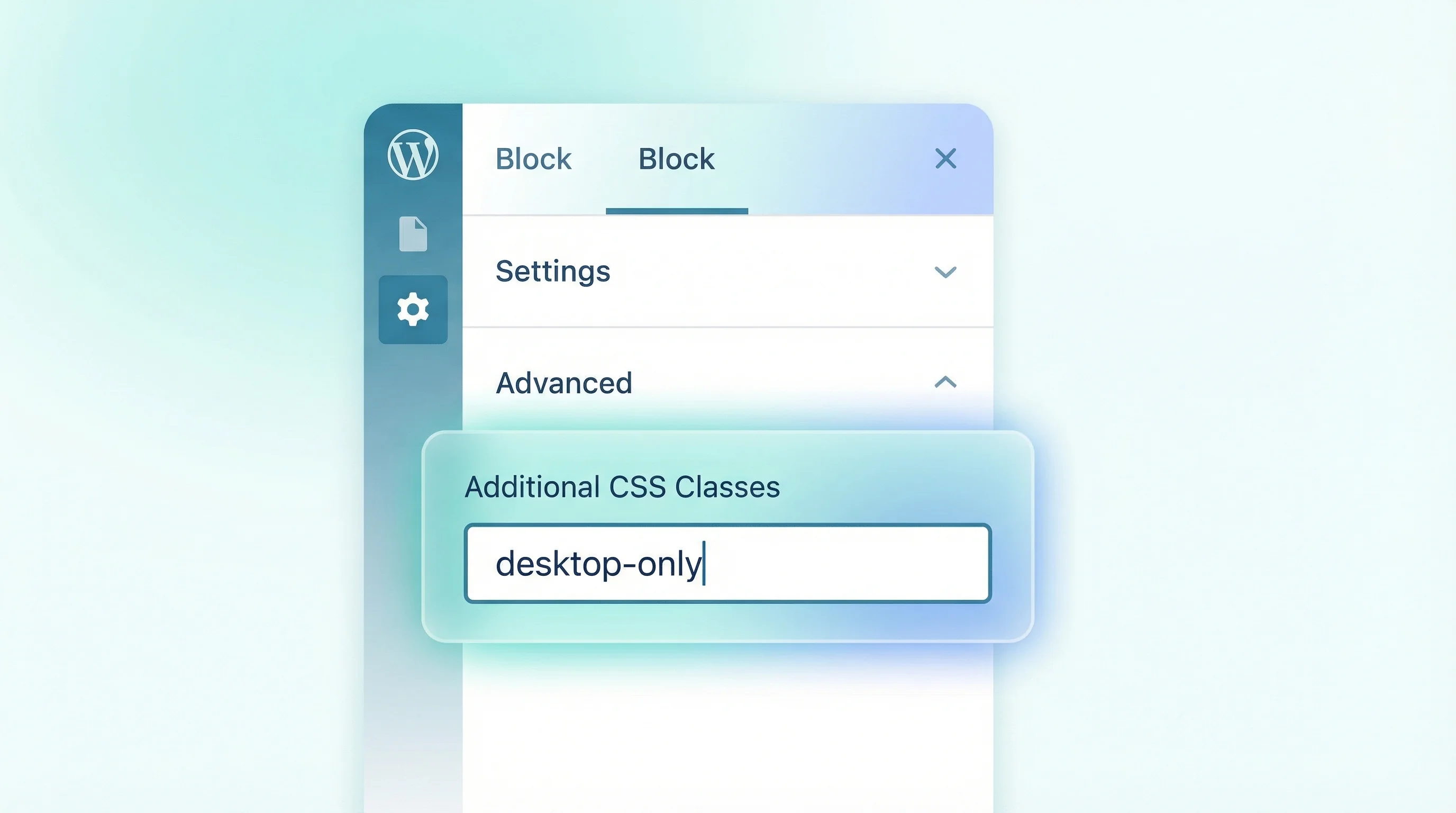
Step 1: Add Clear, Human-Readable Classes
When you duplicate blocks (or groups), give them custom CSS classes in the block settings. Select the block, open the Advanced panel in the sidebar, and add:
- Desktop version:
desktop-only - Mobile version:
mobile-only
That's it. No cleverness. Clever CSS ages badly.
Step 2: The CSS
This covers desktop, tablet, and mobile in a way that matches how WordPress generally behaves:
/* ------------------------------------
   Responsive visibility helpers
   ------------------------------------ */

/* Default: show desktop, hide mobile */
.desktop-only {
  display: block;
}

.mobile-only {
  display: none;
}

/* Mobile and small tablets */
@media (max-width: 781px) {
  .desktop-only {
    display: none !important;
  }

  .mobile-only {
    display: block !important;
  }
}
Copy, paste, done. The !important declarations ensure your utility classes override whatever WordPress or your theme might be doing to the block.
Why 781px?
Because WordPress itself treats 782px and below as "mobile" in the admin and block styles. Using 781px keeps you aligned with core behaviour and avoids weird edge cases where your styles and WordPress's styles disagree about what constitutes "mobile."
The WordPress Developer Blog notes that block themes increasingly rely on theme.json for styling, but responsive visibility isn't something that system handles well yet. Until it does, CSS utility classes remain the practical solution.
Handling Flex and Grid Blocks
Some blocks (Navigation, Columns, Group with layout settings) don't play nicely with display: block. If something looks off after adding the visibility classes, add this:
.mobile-only,
.desktop-only {
  width: 100%;
}
Or if you need flex behaviour preserved:
.mobile-only {
  display: flex;
  flex-direction: column;
}
But only add these if you see layout weirdness. Don't over-engineer upfront.
Optional: Adding a Tablet Breakpoint
If you need separate desktop, tablet, and mobile versions:
/* Hide all by default */
.desktop-only,
.tablet-only,
.mobile-only {
  display: none;
}

/* Desktop: 1025px and above */
@media (min-width: 1025px) {
  .desktop-only {
    display: block;
  }
}

/* Tablet: 782px to 1024px */
@media (min-width: 782px) and (max-width: 1024px) {
  .tablet-only {
    display: block;
  }
}

/* Mobile: 781px and below */
@media (max-width: 781px) {
  .mobile-only {
    display: block;
  }
}
Same idea, same sanity.
Where to Put This CSS
You have options, ranked by reliability:
- Best: Appearance → Editor → Styles → Custom CSS (survives theme updates)
- Even better for the long term: Child theme's
style.css - Avoid: Inline CSS blocks scattered across pages. That way lies madness
Our WordPress Navigation block CSS fix uses a similar approach for controlling responsive behaviour. Once you understand the pattern, you can apply it to many block editor challenges.
Pro Tips (Learned the Hard Way)
After using this approach across dozens of client sites, here's what I've learned:
Duplicate the Group, Not Individual Blocks
If you have a row of three buttons that need to become a column on mobile, wrap them in a Group block first. Then duplicate the entire Group. This keeps your structure clean and makes future edits easier.
Keep Structure Identical Where Possible
The desktop and mobile versions should have the same content, just arranged differently. If you start making content changes to one but not the other, you'll eventually have divergent versions and confusion.
Only Change What Truly Needs to Differ
Maybe the desktop version uses larger text or different spacing. Fine. But resist the urge to create completely different content for each viewport. Future-you will thank present-you.
Document Your Breakpoints
Add a comment at the top of your CSS noting what breakpoints you're using and why. When you (or someone else) returns to this code in six months, you'll want that context.
For more on working with WordPress block themes, see WordPress 6.9's speed changes and the WordPress 7.0 features guide for what's coming next in theme development.
Frequently Asked Questions
Why use CSS duplication instead of responsive CSS properties?
WordPress block themes don't offer native responsive controls for most blocks. While you could use complex CSS to rearrange elements, duplicating blocks and showing/hiding with simple classes is more predictable, easier to maintain, and less likely to break when WordPress updates.
Why does WordPress use 782px as a mobile breakpoint?
WordPress treats 782px and below as "mobile" in both the admin interface and block styles. Using 781px for your max-width media query aligns with core behaviour and avoids edge cases where your styles conflict with WordPress defaults.
Will this approach affect my site performance?
The impact is minimal. Hidden elements with display: none are not rendered by the browser, so they don't affect layout performance. The duplicate HTML does add slightly to page weight, but for most sites this is negligible compared to images and scripts.
Does this work with WordPress Full Site Editing themes?
Yes. This approach works with any block theme including Twenty Twenty-Five, Twenty Twenty-Four, and custom FSE themes. The CSS classes target standard block editor output, not theme-specific markup.
Can I use different breakpoints for different elements?
Yes. Create additional class pairs like tablet-only, large-desktop-only, etc. with their own media queries. Just be consistent with your naming convention and document your breakpoints for future maintenance.
Where should I add the CSS in a WordPress block theme?
The safest option is Appearance → Editor → Styles → Custom CSS as this survives theme updates. Alternatively, add it to a child theme's style.css. Avoid scattering inline CSS blocks across individual pages.
Why use !important in the CSS?
WordPress block themes can apply high-specificity styles to blocks. The !important declaration ensures your visibility classes always take precedence. While normally avoided, it's appropriate here for utility classes that must override any other styling.
Should I duplicate the Group block or individual blocks inside it?
Always duplicate the Group block, not individual blocks inside it. This keeps your structure clean and makes it easier to maintain both versions. Changes to one version can be mirrored to the other by copying the inner blocks.
Need Help With Your WordPress Site?
Whether it's responsive layouts, performance optimisation, or a complete redesign, our WordPress development service builds sites that work exactly how you need them to.
Get in Touch