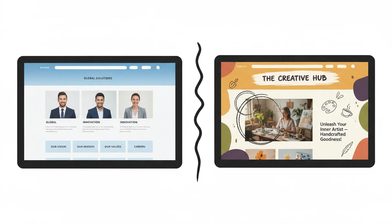
There is a particular kind of website that has become depressingly common in 2026. You know the one. Perfectly symmetrical layouts. Stock photos of implausibly diverse teams high-fiving around a conference table. Sans-serif fonts that look clean but say nothing. A purple gradient that could belong to any company in any industry.
These websites are technically flawless. They tick every design checkbox. And they are completely, utterly forgettable.
I have been building websites since 1995. Thirty years of watching trends come and go. And right now, I am watching something really interesting happen: the most effective websites are the ones that look a little bit human.
Not amateur. Not sloppy. Human.
The distinction matters enormously, and it is something that most web design agencies (including many AI-powered design tools) completely miss. So let me explain why your website probably should not look too perfect, and how to find the sweet spot between authentic and unprofessional.
The Perfection Problem
Here is the uncomfortable truth about modern web design: we have got so good at making polished websites that they have stopped working.
Not technically. The buttons still click. The forms still submit. But psychologically? The connection is broken.
When every website looks like it was generated by the same design system (because increasingly, they are), visitors stop seeing individual businesses. They see a category. "Another marketing agency." "Another accountant." "Another tradesperson trying to look bigger than they are."
And here is where it gets interesting for small business owners in particular: that polished, corporate aesthetic actively works against you.
"86% of consumers say authenticity is a key factor when deciding what brands they like and support."
- Edelman Trust Barometer, 2024
That statistic should stop you cold. Nearly nine out of ten potential customers are making decisions based on whether you feel authentic. And nothing screams "inauthentic" quite like a small local business with a website that looks like it cost a quarter million pounds to build.
The cognitive dissonance is immediate. A plumber in Kettering with a website that looks like it belongs to a Silicon Valley startup? Something does not add up. And when something does not add up, trust evaporates.
The Wabi-Sabi Web
There is a Japanese aesthetic philosophy called wabi-sabi that has become increasingly influential in design circles. It celebrates impermanence, imperfection, and incompleteness. The beauty of a hand-thrown ceramic bowl with slightly uneven edges. The character of aged wood. The humanity visible in handcraft.
"Wabi-sabi nurtures all that is authentic by acknowledging three simple realities: nothing lasts, nothing is finished, and nothing is perfect."
- Richard Powell, Wabi Sabi Simple
This is not about making websites look broken or amateur. It is about allowing humanity to show through the design. About making choices that a machine would not make. About creating something that feels like it was made by a person, for people.
And increasingly, this approach is what separates businesses that connect with their customers from businesses that merely exist online.
What Strategic Imperfection Actually Looks Like
Let me be very clear about what I am not suggesting: do not make your website look cheap, broken, or unprofessional. Strategic imperfection is not an excuse for poor craftsmanship. It is about making deliberate choices that communicate humanity.
Here is what works:
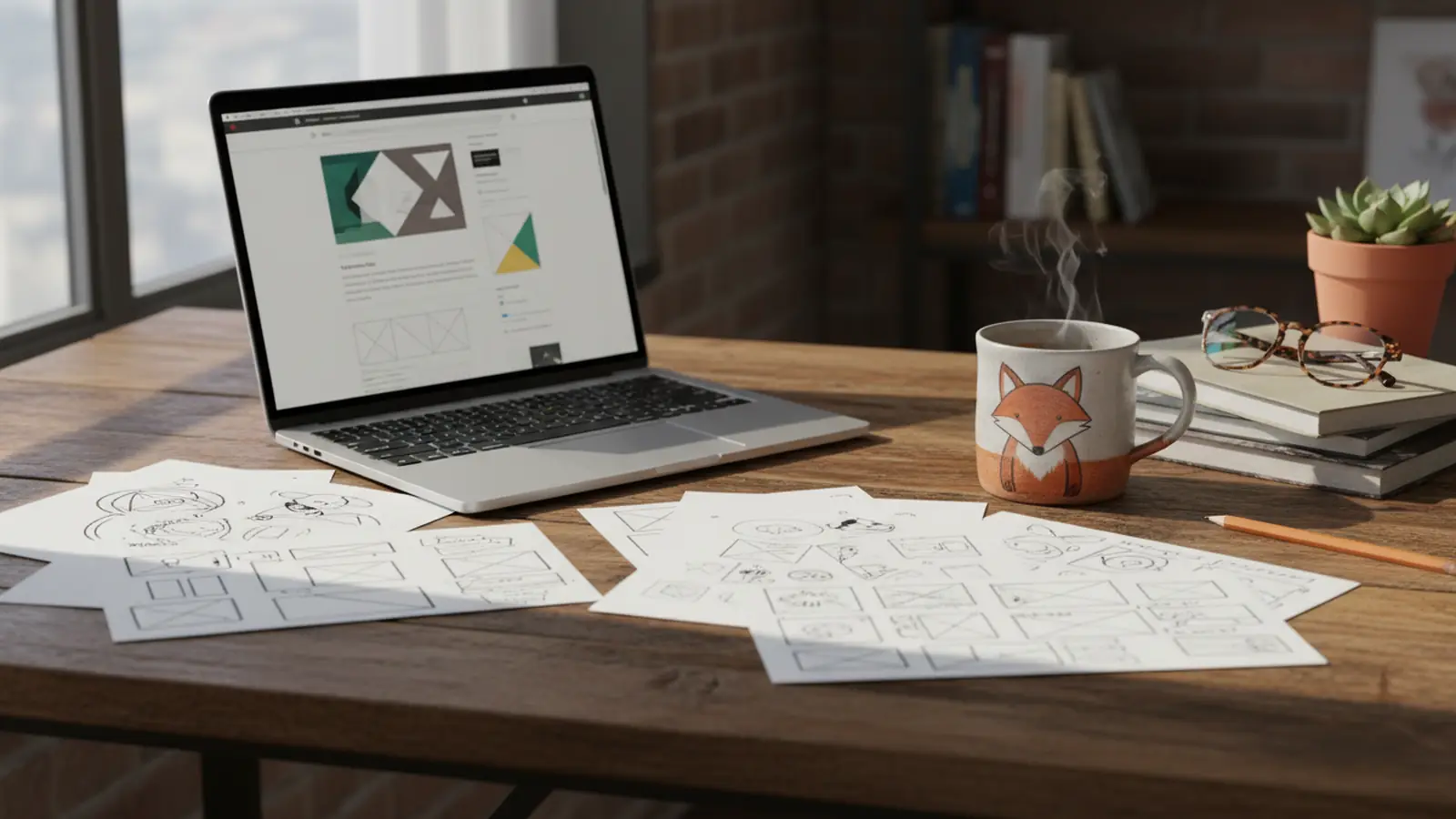
Genuine photography. Real photos of real people, even if they are not magazine-perfect. A slightly candid shot of you at work beats a stock photo every single time. Customers can tell the difference instantly, even if they could not articulate why.
Handwritten elements. A hand-drawn logo. Handwritten annotations. Custom illustrations that look sketched rather than vector-perfect. These signal that a human was involved in creating something specific for this business.
Asymmetry with purpose. Layouts that break the grid occasionally. Images that bleed off-centre. Design choices that feel intentional but not mechanical.
Personality in copy. Writing that sounds like a person talking, not a marketing template being filled in. Opinions. Humour. The occasional sentence fragment. Like this one.
Visible craftsmanship. Details that show care was taken. Subtle textures. Thoughtful transitions. The small touches that machines do not think to add because they are optimising for efficiency, not humanity.
The Japanese pottery concept of kintsugi is useful here: rather than hiding cracks, you fill them with gold. The repair becomes part of the beauty. Your website's "imperfections" should feel like golden seams, intentional highlights of humanity, not embarrassing flaws to minimise.
When NOT to Use This Approach
I am going to be honest about the limitations, because too many design articles pretend their advice is universal when it is not.
Strategic imperfection works brilliantly for:
- Local service businesses (trades, hospitality, personal services)
- Creative industries (design, photography, crafts)
- Professional services where trust is personal (solicitors, accountants, consultants)
- Retail businesses with a story to tell
- Any business competing against faceless corporates
It works less well for:
- Financial institutions handling large sums (you want those to look boringly corporate)
- Medical and healthcare providers (clinical precision matters)
- Enterprise software and B2B tech (buyers expect polish)
- Luxury brands (different rules entirely)
Know your industry. Know your customers. A boutique bakery should not look like Barclays. But Barclays should not look like a boutique bakery either.
The Trust Factor
Here is something I have observed repeatedly over three decades of building websites: the businesses that try hardest to look bigger than they are often perform worse than those that embrace their actual size.
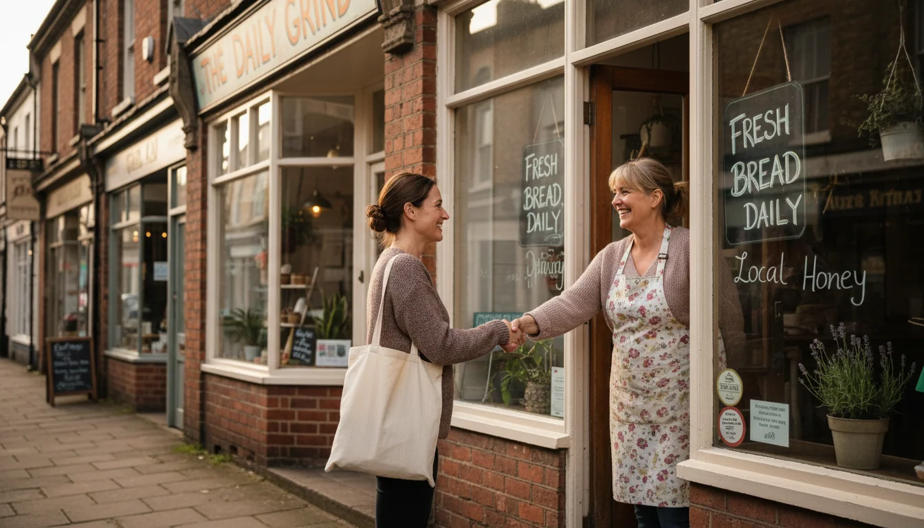
A one-person accountancy practice with a website that uses "we" throughout and features stock photos of a corporate office? Customers feel deceived the moment they walk through the door and find one person at a desk. That breach of expectation destroys trust.
The same practice with a website that shows the actual practitioner, uses "I" when appropriate, and features their actual (modest but tidy) office? Customers arrive with accurate expectations. No deception. Trust intact.
This extends to every aspect of design. An over-designed website creates expectations of over-delivery. If your business cannot match those expectations, you have set yourself up to disappoint.
"Pare down to the essence, but don't remove the poetry."
- Leonard Koren, Wabi-Sabi for Artists, Designers, Poets & Philosophers
Koren's advice is perfect for web design. Strip away the unnecessary. Remove the stock photos. Eliminate the corporate jargon. But keep the personality. Keep the humanity. Keep the poetry.
Practical Steps for Small Businesses
Here is how to apply this thinking without a massive budget:
Audit your current site for authenticity. Does it sound like you? Does it show the real business? Would a customer recognise the place/person when they arrive? Our guide to what makes a website actually work covers the measurable criteria that separate effective sites from decoration.
Replace stock photos with real ones. You do not need professional photography (though it helps). A well-lit phone photo of your actual workspace, your actual team, or you actually doing your work is worth more than a perfect stock image.
Rewrite copy in your actual voice. Read your website content aloud. Does it sound like something you would actually say? If not, rewrite it until it does.
Add one hand-made element. A hand-drawn logo mark. A handwritten signature. A custom illustration. One element that shows human involvement.
Show your process. Behind-the-scenes content, work-in-progress shots, the mess and effort behind the polished result. This builds connection.
Include real testimonials with photos. Real customers, real names, real faces. Specifics beat generics every time.
The AI Design Trap
There is a particular irony in 2026: AI can now generate perfectly polished website designs in seconds. The AI website builder market hit $6.3 billion this year. And this is precisely why human design matters more than ever.
When anyone can have a "professional" website for free, professional stops being a differentiator. The new differentiator is unmistakably human. The touches that AI would not think to add. The personality that cannot be templated. The imperfections that signal authenticity.
I am not anti-AI. I use AI tools in my work every day. But I use them as tools, not replacements. The final decisions, the personality, the humanity: that still comes from working with real people who understand that web design is not just about looking good. It is about building trust.
And trust, it turns out, often looks a little imperfect.
This principle extends beyond design into writing too. The same question, "Should AI output be accepted as-is, or should humans always have the final say?", is now playing out in heated debates on LinkedIn, where industry voices clash over whether AI writing tools democratise communication or simply produce a "sea of sameness." That suspicion has grown to the point where people are having their work dismissed as AI simply because it reads clearly. The answer for both design and writing is the same: the best work is human-led, with AI as a tool that serves human judgment.
Finding the Balance
The goal is not to make your website look amateur. The goal is to make it look intentionally human.
There is a sweet spot between sterile perfection and unprofessional chaos. The best websites live there. They feel crafted but not corporate. Professional but not impersonal. Polished in the ways that matter, imperfect in the ways that connect. Google's December 2025 core update rewarded design-first sites that put user experience ahead of template uniformity, evidence that search engines are starting to value the same qualities visitors do.
For small businesses especially, this balance is your competitive advantage. You cannot outspend the corporations. You cannot out-polish the AI-generated templates. But you can out-human them. You can be real in ways they simply cannot.
And in an increasingly synthetic digital world, real is becoming rare. Rare is becoming valuable. Valuable is becoming profitable.
Your imperfections are not bugs to fix. They might just be your most valuable features. If you want a site that connects with customers through authenticity rather than corporate polish, our web design service is built on exactly this philosophy.
Frequently Asked Questions
What is strategic imperfection in web design?
Strategic imperfection is a design approach that deliberately incorporates human touches, asymmetry, and authentic elements rather than pursuing pixel-perfect, template-driven perfection. It includes using real photography, handwritten elements, personality-driven copy, and layouts that feel crafted by humans rather than generated by machines. The goal is to build trust through authenticity rather than impress through polish.
Will not an imperfect website look unprofessional?
Strategic imperfection is not about being sloppy or amateur. It is about being intentionally human. A website can be well-crafted, functional, and professional whilst still showing personality and authenticity. The key difference is between calculated humanity (handwritten elements, real photos, personality) and actual flaws (broken layouts, spelling errors, poor functionality). The former builds trust; the latter destroys it.
What types of businesses benefit most from this approach?
Strategic imperfection works particularly well for local service businesses, creative industries, personal professional services (accountants, solicitors, consultants), hospitality, and any business competing against larger, faceless corporations. It works less well for financial institutions, healthcare providers, enterprise software, and luxury brands where different expectations apply.
How much imperfection is too much?
The balance point varies by industry and audience, but a good rule is: functionality must be flawless, aesthetics can be human. Your forms should work perfectly. Your navigation should be clear. Your site should load quickly. But your photos can be candid, your copy can have personality, and your design can show the hand of its maker. Imperfection in appearance, perfection in performance.
Should I use real photos even if they are not professional quality?
In most cases, yes. A well-lit, reasonably composed smartphone photo of your actual business, team, or work beats a perfect stock photo because it is real. Customers can instinctively tell the difference. That said, lighting and basic composition matter. A dark, blurry photo helps no one. The sweet spot is authentic content captured with care, even if not by a professional photographer.
Can I achieve this with AI website builders?
AI website builders are excellent at generating polished, professional templates, but they struggle with intentional humanity. You can use AI-generated designs as a starting point and then add human touches: replace stock photos with real ones, rewrite copy in your voice, add handwritten or hand-drawn elements. The AI provides efficiency; you provide personality.
Is there evidence that authenticity affects purchasing decisions?
Yes. According to the Edelman Trust Barometer, 86% of consumers say authenticity is a key factor when deciding what brands they like and support, and 91% say they are willing to reward brands for their authenticity with purchase, investment, and endorsement. Authentic presentation directly influences customer behaviour and revenue.
Does this approach cost more or less than traditional web design?
It can actually cost less. Real photos from your smartphone cost nothing compared to stock photo subscriptions. Writing in your own voice requires no copywriter. The expensive part is thoughtful design that knows when to be polished and when to be human. That requires skill and experience. But the raw materials of authenticity are often cheaper than the raw materials of perfection.
Want a Website That Builds Trust?
We design websites that feel human: professional without being corporate, polished without being generic. If you want a site that connects with customers rather than just existing online, let's talk.
Get in Touch